Step & Repeat
Multiple Paste
Save as...
Collect for
Output
Embedding vs Linking
Graphics

|
Little Ways to Make
Your Day Go Easier and Get You Home Earlier.
They promised us that computers would make
our lives easier and we'd all have more
spare time to enjoy a life of leisure. Well,
I don't know about you, but I never seem to
have enough time in the day to accomplish
everything. Yes, computers have made some
tasks easier - but they have also put the
burden of responsibility upon some of us who
have never had to deal with issues such as
separating two to four color images,
trapping an electronic file, etc. So I'd
like to share with you some tricks and
shortcuts I've found during my tenure here
at OverflowPress. By the way, if
you have any tips you'd care to pass along,
please feel free to contact me, John Taylor
at:
jtaylor@printingforamerica.com.
• Give yourself plenty of time. Each
step of the process can have glitches. Give
yourself some breathing room - start early!
• Start thinking about your design before
you turn on the computer. Some things to
consider:
~ Ask your printer for information and
specifications, such as line screen
resolution, how many colors, what kind of
colors, paper or film (right reading
emulsion down or up), etc. This is the time
to contact your service bureau to be sure
that they can accommodate your file
application and transport media.
~ Set up your document to the final trim
size of the finished piece. You can extend
images beyond the indicated edge of the
page, such as bleeds, or dotted lines to
indicate folds - anything that actually
touches the page will print out. The
computer or imagesetter will automatically
and more accurately place trim marks to the
size of the document when imaging.
~ Gripper margin is the non-printing area on
the leading edge of the paper needed to
carry it through the press. The size of the
margin differs with each press. Our margin
is 3/8 of an inch. If you can design your
piece to fit on a sheet the size of your
finished piece, you're saving on paper
waste, and the time to wait for the ink to
dry before we can cut it. Set your default
margins in your layout programs for new
documents to be 3/8", so you won't need to
worry about measuring.
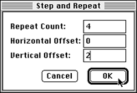
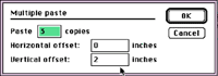
Be
accurate. Use your information palette
to type in the exact position of your image
or type box. If you are duplicating images,
use the step and repeat command in Quark
Xpress, or multiple paste items in
PageMaker. These two commands make pasting a
breeze.
Create the
image/design/type to be repeated. Copy the
item(s) with the pointer tool. Go to the
repeat/multipaste command and specify how
many times it will be repeated, and the
direction to paste - horizontal or vertical
- and sit back and watch!
• Be neat. In the design stage, I
often import graphics to try them out,
moving them off the page when I can't
decide, or store copied items on the
pasteboard. Once you've settled on a design,
get rid of all the extraneous stuff.
Although they won't be printed on the page,
they will still be imaged through the
process of printing your document - and slow
it down. Clean up after yourself. Zoom out
to fit in window view, or even fit in
pasteboard view and, with the pointer tool
selected, choose "select all" to find all
those pesky pieces and delete unwanted
items. When you've done that, do a "SAVE
AS..." instead of a plain SAVE to completely
rewrite over the old file - it saves a more
compact, efficient file.
• Print out and carefully examine your
job... including composite and color
separations. Many glitches and mistakes can
be easily found on paper and missed on the
screen. It helps us considerably on our end
if you bring these with your job. We match
them up on the light table with our output
to catch any possible text re-flow, and they
help us understand your job at a glance.
Label each separation with the intended
color, and indicate if they are printed out
at 100% or else the % reduced. (Often, to
indicate a bleed, you may wish to print out
at a reduced size, or better yet, print out
on an oversized sheet of paper.)
If your job takes a long time to print out,
a few things to consider are:
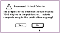
In PageMaker, you
have a choice to include a complete copy of
an imported graphic in the PageMaker
document itself - NOT a good idea, as it
vastly increases the size of your document.
Link them instead and include those original
graphics on the disk with the job.
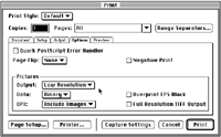
Reduce the resolution of the print out - ask
for 300 dpi instead of something higher. In
Quark, under the Options tab in the print
dialog box, you have the option of printing
your graphics at low resolution.
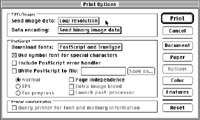
In PageMaker you can choose to print out a
draft copy - greeking your images, or in the
print dialog box, Options button, you can
send TIFF images as low resolution.
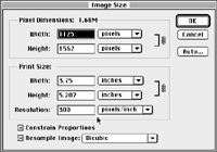
Crop and size your images in PhotoShop,
instead of in your page layout program. It
is a good rule of thumb for the resolution
size, expressed in pixels per inch, to be
two times the lines per inch (lpi) of the
final output. For example, if your piece
will be imaged at 150 lpi, your photo, at
100%, should be 300 pixels per inch. This is
a good idea to do as general practice
anyway, as you get better results and faster
imaging.
Do not use 'styles' on your fonts. (Mac
platform only) Bold, italic, underline,
drop shadow, outline and the like, applied
through the Type Styles Menu work with laser
printers, but may cause unpredictable
results with imagesetters. Sometimes,
imagesetters cannot replace the stylized
versions with the actual PostScript version
of bold, italic, etc. Sometimes they ignore
the styles altogether, but leave the
letterspacing spread out, or substitute the
PostScript version, but do not change the
letterspacing, so your type will be squished
together. For accurate typesetting, specify
those typefaces from the Fonts Menu instead
of the Type Styles Menu. Effects like drop
shadow, underline, etc. will have to be
crafted utilizing the actual fonts and
graphic effects in order for them to appear
correctly on film output. (EG: for drop
shadow, copy the type and make it a tint of
the color used and offset it manually.)
Styles on PC platform. Font selection
on the PC platform utilizes styles to select
the Normal, Bold, Italic and Bold Italic
versions of a font. To image correctly,
those font versions must be installed in
your system. Do not use the other style
options such as underlining, shadow,
outline, etc. (see above explanation.)
Supply all fonts used in your piece.
PostScript fonts are the most reliable and
widely used fonts in the printing industry.
They are made up of two parts. The screen
fonts, usually bunched inside a suitcase
icon, contain the code for the monitor to
show the font in detail on your screen. The
printer fonts are individual files that
contain the code to describe the different
versions of the font (bold, italic, etc.) to
the PostScript printer. Both are needed to
image your job successfully.
Supply all graphics used in your project.
Quark really makes it easy to save all
related EPS and TIFF images and the Quark
file in a folder along with a DETAILED
report including a list of all the fonts
used in your document. Be aware that it does
not copy PICT files! Under the File menu,
choose the feature "Collect for Output".
Select a disk, select a new folder, name it,
and hit the Collect button. Sometimes the
report is overkill, but better to have too
much than not enough information.
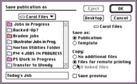
In PageMaker, use the
save as... feature under the file menu, and
you'll find in the dialog box, under
Copy: you can select the button the says
"Files for remote printing", select a
folder, and it copies all imported graphics
you used all in one place. An even better
feature is the ‘Save for Service Provider’
plug-in under the Utilities Menu. This
option saves your fonts you used in the
document as well as your imported graphics,
document, and a report all in one folder.
Communication is important! Tell the next
person in line, whether at the service
bureau or printer, what's going on. You can
do this in a number of ways. You can
physically speak to each person along the
route of your job, telling them all the same
information along the way. Or, you can write
it down once, and it can be passed along to
all. Each service bureau or printer will
have a form to fill out that describes your
job, lists everything used to create it, and
informs the pre-press people what kind of
final output you want. Although this seems
tedious, consider the first option listed
here. You don't want a call from your
service bureau asking for detailed
information at the last minute! Often, it's
easier and more efficient to fill out the
form while you've got your job open on your
computer. It's then fairly easy to check the
fonts used, the names of the imported
graphics, the PMS colors, etc.
Return to the top
|
